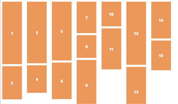
So I have been trying to create a grid which has a masonry structure and was trying to find a simple way to create it without having any DOM related heavy lifting, ie wihout any javascript. I wanted to use CSS to do this and I thought it might be simple but it’s not the simplest of things to achieve with CSS alone.

It’s very simple to achieve a column layout with pure masonry but the catch is your content flows from top to bottom and then to the next column

.container{
    columns: 3 300px;
}
Just this one line can give you a masonry structure, but AT WHAT COST?

You will have a layout that will not support pagination, This means when ever new content is added, the last column will have more children and the last row that user expects to be populated with new childrens will not be working as expected.
To solve this problem we can use a different approach of css grid. Here we use a grid container.
<div id="masonary-container">
    <!-- Children -->
</div>
#masonary-container {
display: grid;
grid-template-columns: repeat(auto-fill, 280px);
grid-auto-rows: 10px;
}
/* this will avoid overflow of images in the grid */
img {
width: 100%;
height: 100%;
object-fit: cover;
}Here
grid-template-columns: repeat(auto-fill, 280px): This instructs the browser to automatically fill the available space with as many columns as possible with minimum width of 280px.
grid-auto-rows: 10px: This specifies the minimum height of each row. The rows will be at least 10px high, but they can be taller if there is enough content to fill them.
Here is where the magic happens
We create three classes in our CSS File
.small {
  grid-row-end: span 16;
}

.medium {
  grid-row-end: span 23;
}

.large {
  grid-row-end: span 35;
}
This will help us get the masonry layout. In our javascript code, we can add a logic to add .small | .medium | .large class depending upon the where its the the nth | n+1th| n+2th child.
const container = document.querySelector('.container');
let xwidth = 400;
let ywidth = 400;
let currentCount = 0;

container.innerHTML = getCatsCards();

function getCatsCards() {
  const cardsMarkup = Array.from({ length: 10 }).map((_, i) => {
    xwidth++;
    ywidth++;

    let sizeClass = getCurrentSizeClass(i)
    return `
      <div id="card-${i}" key="${i}" class="${sizeClass} card">
        <img src="//source.unsplash.com/${xwidth}x${ywidth}?cat" alt="Cat Image">
        <span>${currentCount + i+1}</span>
      </div>
    `;
  }).join('');

  currentCount = currentCount + 10;
  return cardsMarkup;
}


function getCurrentSizeClass(i) {
    if (i % 3 === 0) {
      sizeClass = 'large';
    } else if (i % 2 === 0) {
      sizeClass = 'medium';
    } else {
      sizeClass = 'small';
    }
  return sizeClass;
}
With some fine tuning we can get a final result which is almost as good as the pinterest masonry layout. This can handle pagination and logical flow of data in the DOM.